Crafting a user-centric Product Listing Card component for Jio Design System 2.0, optimizing product discovery and purchase journeys within Reliance Retail's diverse e-commerce ecosystem.

Products & Brands under Reliance ecosystem include:
Ajio, Jio.com shop, JioMart, Reliance Digital, NetMeds, NetMeds Wholesale, Tira, Reliance Jewels, Hamleys many more. We have taken into account both the existing products within our ecosystem and potential future products.

The product listing card component aims to provide a quick overview of essential product information, enabling users to compare options efficiently.
It also aids users in making informed decisions during their ordering experience.
Challenge: Design a product listing card component for the Jio Design System that is:
Versatile: Seamlessly integrates across various applications within the Jio ecosystem.
Consistent: Maintains a unified visual language for a cohesive user experience.
Usable: Provides clear information and facilitates user interaction to drive desired actions.
Attention-grabbing: Effectively captures user attention and compels them to engage with the product.
Goal: Enhance user experience (UX) on Jio e-commerce platforms by creating a standardized product listing card component that is both informative and engaging. This component will serve as a building block for future applications, ensuring consistency and ease of use across the Jio ecosystem.
The process of creating a component requires careful consideration of user experience (UX) principles, consistency, accessibility, and usability.
We have followed a specific set of processes to deliver a product listing card component for our Jio Design System.


Efficiency:
For designers, developers & other stakeholders, It will streamline the design and development process by offering pre-defined Product Card UI component and guidelines.
For users, this efficiency will translate to faster loading time, quicker navigation, and smoother interactions.
Consistency & predictability
Consistent product card component across the Jio ecosystem. This consistency helps users build familiarity with the interface, making it easier for them to navigate, understand, and use the product.
When users encounter familiar patterns and behaviours throughout an application, they can predict how certain elements will work. This reduces cognitive load and increases confidence in their interactions.
Cross-platform consistency
The product cards will play an important role in ensuring a consistent e-commerce experience across various screen sizes and device types. Users can seamlessly transition from one device to another without feeling disoriented.
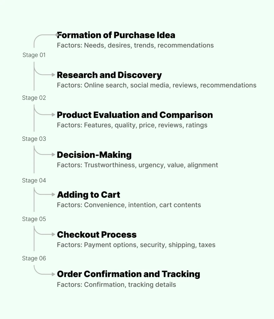
From the initial thought or need to the final execution. Specific steps may vary depending on the type of purchase, we created a general framework as our starting point:
Our goal
• Find out the types of PLC cards that exists in Reliance Retail ecosystem and in competitor products.
• Find out all the attributes found on PLC card and prioritize their needs.
• Document micro-aspects like placement, alignments and behaviour of the product card and it's attributes.
Step 1: Finding use-cases
We have gone through all the products in the Reliance Jio retail ecosystem and competitor products. 150+ screenshots collected.
We have shortlisted 100 use cases found in 26 brands.

Step 2: Find out attributes of PLC. Document mico aspects
Then, we made a list of all the different attributes found in the existing product listing cards. Those were: image, product name, price, variants, offer badges, wishlist CTA, add-to-cart CTA etc.
We documented micro-aspects of the product cards.
This process helped us
• Identify product card types.
• Types of attributes.
• Hierarchy.
• Placement of attributes.
• Alignments of attributes.


Step 3: Prioritise attributes & micro-aspects
For prioritisation, we list down all the attributes found on the PLCs & number them based on occurrence.


From 100 (shortlisted) use-cases found in 26 brands
• From above research in 98% cases there are fixed attributes of the cards:
image, product name, price and offer.
• Primary CTAs are 64 time are at the bottom of content, 36 times no button used.
• Alignment used for Primary CTA: 34 times RIGHT, 19 time left, 11 centrally aligned.
• 53 times hierarchy of cards have been Product name (brand name+attribute together) and then price.
• 33 time brand name, product name and price hierarchy has been used. It is mostly in fashion and fmcg brands.
• 14 times mixed hierarchy has been used.
• Carts mostly have the hierarchy in brand name+attribute together and then price.
45+ e-commerce products & partner brands within our Jio Ecosystem cater to a diverse range of target audiences, depending on the specific products or services they offer.
We organized meetings with our stakeholders from each product to gain insights into our target audience.
Additionally, we examined the existing research that the teams have conducted to define our target audience.
Here is a quick overview of the target audiences for Jio's major e-commerce verticals:
Fashion and Apparel:
Demographics: Primarily young adults, teens to early thirties.
Psychographics: Trend-conscious, brand-conscious, socially active, fashion-forward, digital-savvy.
Electronics and Technology:
Demographics: Broad age range, tech enthusiasts, professionals.
Psychographics: Early adopters, gadget lovers, digitally connected, tech-savvy, value innovation.
Home and Furniture:
Demographics: Homeowners, families, middle to upper-income.
Psychographics: Home-oriented, interior design enthusiasts, lifestyle-driven, value comfort and aesthetics.
Grocery and Supermarkets:
Demographics: Diverse age groups, families, individuals of all income levels.
Psychographics: Budget-conscious, health-conscious, meal planners, convenience seekers.
Automotive:
Demographics: Adults, car owners, various income levels.
Psychographics: Car enthusiasts, safety-conscious consumers, environmentally aware.
Beauty and Personal Care:
Demographics: Wide age range, predominantly female consumers.
Psychographics: Beauty enthusiasts, self-care advocates, interested in wellness, seek personal expression.
Sporting Goods:
Demographics: Active individuals, sports enthusiasts, all ages.
Psychographics: Health-conscious, outdoor lovers, fitness enthusiasts, team players.
Home Improvement and DIY:
Demographics: Homeowners, adults, DIY enthusiasts.
Psychographics: Handy, creative, project-driven, value self-sufficiency.
Toy Stores:
Demographics: Parents, grandparents, children of various ages.
Psychographics: Family-oriented, entertainment seekers, education-conscious.
Jewelry and Accessories:
Demographics: Adults, primarily females, various income levels.
Psychographics: Luxury seekers, sentimental value, fashion-conscious, gift buyers.
Pharmacy and Health Products:
Demographics: All ages, health-conscious individuals.
Psychographics: Wellness seekers, individuals with specific health concerns, brand loyalty.
Bookstores:
Demographics: All ages, education levels.
Psychographics: Intellectuals, avid readers, learners, seekers of diverse perspectives.
Please note that research was done for all the verticals like grocery, tech, fashion, beauty, medicine, quick commerce & others.
To keep the case study short and to the point I have shown here the whole process using "FASHION" vertical as an example.
The intention was to get more insights into how users interact with the Fashion Product Listing Cards.
Users interviewed for Fashion vertical: 20
Please note that there were scenarios when we deviated from the list of questions we prepared. We have also used simpler terms & languages familiar to the user while asking certain questions.
Contextual Observation: Can you walk me through the process of how you typically shop for fashion products online, starting from when you decide to browse for a specific item?
Decision-Making Process: When you are browsing a list of fashion items, how do you decide which one to click on or explore further? What factors influence your decision?
Use of Filters and Sorting: Do you use filters or sorting options to refine your search results when looking for fashion products? If so, which filters or sorting criteria are most important to you?
Challenges and Frustrations: Can you recall any specific challenges or frustrations you've experienced while using product listing cards on fashion websites or apps? Please share any examples.
Information Needs: What information do you consider essential to be displayed on a product listing card? Are there any pieces of information that you often find missing or less prominent?
Visual Appeal: How important is the visual design of product listing cards to you? Are there specific design elements (e.g., images, color schemes, typography) that you find particularly appealing or engaging?
Overwhelm and Information Density: Have you ever felt overwhelmed by too much information or too many options when browsing fashion products? How can the design of product listing cards help make this experience smoother?
Grid vs. List View: When browsing fashion products, do you prefer a grid view or a list view? Could you explain the advantages and disadvantages of each layout from your perspective?
Interaction Preferences: What are your thoughts on interactive or dynamic elements on product listing cards, such as hover effects or quick view options? Do these features enhance or hinder your shopping experience?
Accessibility Considerations: Are there any accessibility considerations (e.g., font size, color contrast) that you believe should be taken into account when redesigning product listing cards?
User Reviews and Ratings: How do user reviews, ratings, and product descriptions influence your decision-making process when shopping for fashion products? How should these elements be presented on a product listing card?
Call-to-Action Buttons: Do you have any preferences regarding the placement and visibility of call-to-action buttons (e.g., "Add to Cart," "Buy Now") on product listing cards?
User-Friendly Features: Can you share any features or design changes you would like to see in product listing cards to improve the overall user experience on fashion websites or apps?
Consistency Across Platforms: How important is consistency in the design of product listing cards across different fashion websites or apps to you? Are there specific design elements that you believe should be standardized for better usability?
Experience Variation: Have you noticed any variations in the user experience of product listing cards across different fashion websites or apps? If so, what are the main differences that stand out to you?
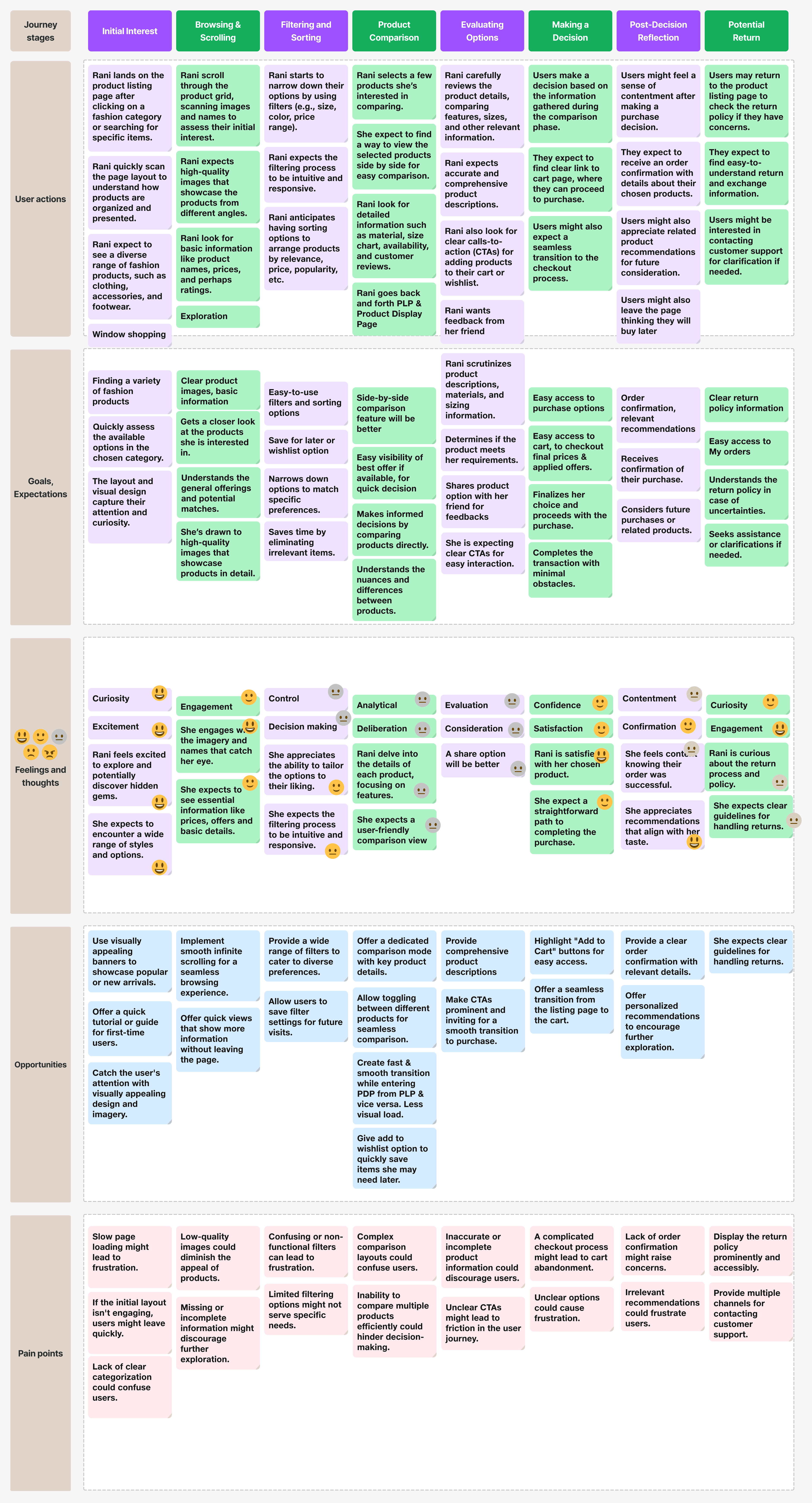
Having gained an understanding of the fashion target audience, our next step was to delve into the journeys of each persona.
We transcribed interview recordings & organised our notes from user research sessions.
We used FigJam to store and manage our qualitative data, ensuring it is easily accessible to all our stakeholders and well-organized.
We created journeys of each persona/personas from all our verticals. This helped us in generating ideas/finding user needs to design the master PLC component.
Please note that, there were existing user journeys and interview findings created by designers specific to products. We organised collaborative sessions whenever possible. Those sessions helped us a lot.
Journey of one of our fashion persona

We conducted affinity diagramming sessions to filter out and prioritize major user needs/attributes of the PLC component.
As a part of the affinity diagramming process, we gathered all the key stakeholders & few members from the cross-functional teams (who were involved in this project directly or indirectly).


Scenes from one of our Affinity Diagramming session
The above processes helped us list the attributes from the perspective of real users' needs instead of relying solely on competitive benchmarks.
Here are the Fashion PLC attributes/user needs arranged in priority:
Priority: High
Product Image: Include a high-quality image of the product that accurately represents its appearance. Multiple images from different angles or showing the product being worn can be even more helpful.
Product Name: Clearly state the name of the product, including any specific style or color variations.
Price: Clearly display the price of the product
Offers: Including any discounts or promotions if applicable.
Add to wishlist: Give users option to wishlist their favourite products
Priority: Medium
Customer Reviews and Ratings: If available, include customer reviews and ratings to provide social proof and build trust with potential buyers.
Color Options: If the product is available in multiple colors, list each color option along with its corresponding image if possible.
Related Products: Suggest similar or complementary items.
Size and Fit Information: Include details about available sizes and provide guidance on how the product fits (e.g., true to size, runs small, etc.). This can help customers make informed decisions about which size to choose.
Shipping Information: Provide details about shipping options, estimated delivery times, and any applicable shipping fees.
Add to Cart/Buy Now Button: Include a prominent call-to-action button that allows customers to easily add the product to their cart or proceed directly to checkout.
Priority: Low
Product Description: Provide a brief but informative description of the product, highlighting its key features, materials, and any unique selling points.
Material and Care Instructions: Specify the materials used to make the product and provide care instructions to help customers properly maintain it.
Availability: Indicate whether the product is currently in stock and ready to ship or if it's on pre-order or backorder.
Return Policy: Briefly outline the return policy for the product, including any conditions or restrictions. Quick view
Both user journey mapping and our initial Jio ecosystem analysis & competitor analysis helped us in prioritization of the user needs.
The insights gathered from research on the Jio ecosystem and competition analysis helped us identify and prioritize user needs from both a competitive and existing attributes perspective. They also informed certain visual design decisions.
The insights from the user journey map helped us identify and prioritize needs from both user and business perspectives. This facilitated making design decisions specific to each vertical while keeping business stakeholders informed.

We conducted an affinity diagramming session with all stakeholders, brainstormed together, and agreed upon the final list of needs/attributes, along with their priority, for the super product listing card structure.
Now we created a comprehensive list of all possible needs and assigned priorities to them.
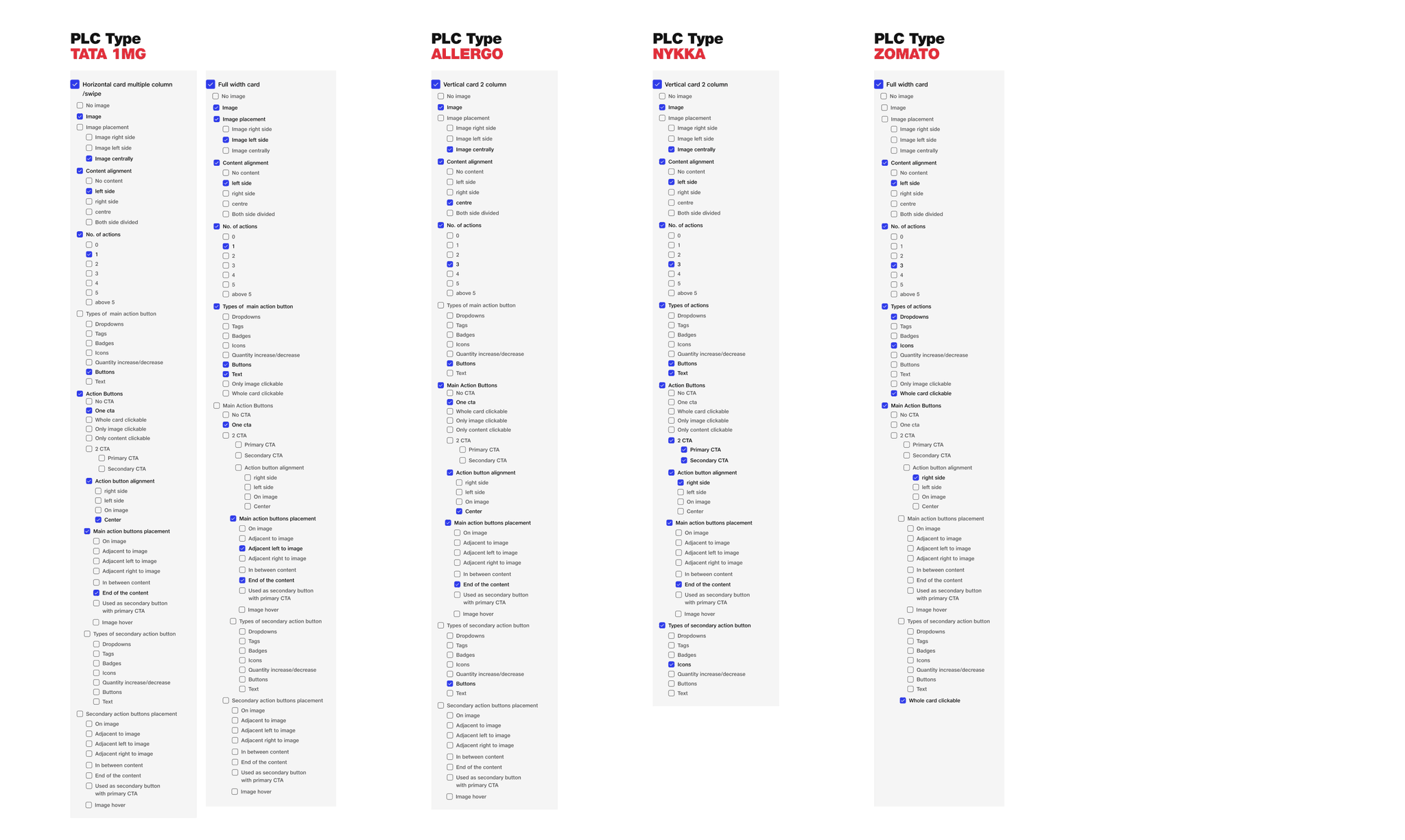
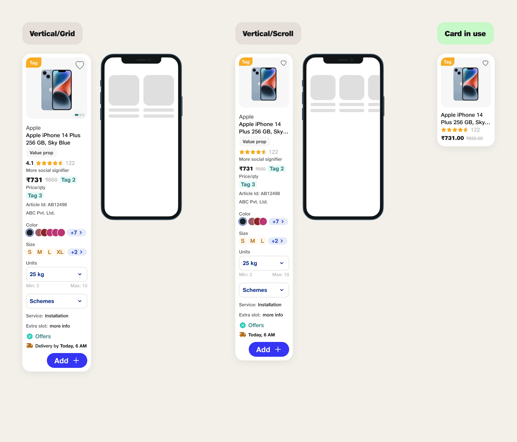
Comprehensive list of major attributes of Vertical/Grid PLC
Identifier
• Image (High)
• Elements on image badges/icons in all directions (Medium)
• Action item on images (Medium)
• Naming (slot for brand + product name) (High)
Ratings
• Ratings (High)
• Other social signifiers (Low)
Pricing
• Selling price (High)
• Price/qty (Medium)
• Cut price (Low)
Offers
• Discount (High)
• Any other deal (Medium)
• Multiple offers (Low)
Sub-info
• Authenticators (Medium)
• Usps (Medium)
• Alerts (Medium)
• Services/installation/more info (low)
Action button
• Primary (Medium)
• secondary (Medium)
Variants
• Just info (Medium)
• Selectors (Medium)
• Dropdown (Medium)
Who we are?
Jio is by your side in every walk of your life – we connect you with everything you need to live your life to the fullest. Connection is the heart of the JioBrand: to enable India. From getting connected to home, health, shopping, entertainment, business and so much more – Jio connects you to any need, opportunity & joy.
Jio experience principles
Our experience principles are the foundation of every interaction we have with our customers. Everything from visual design to UX, from user flows to products should live and breathe these principles to ensure that we create one user experience, one feeling, one Jio. For whatever we create for Jio, let the experience principles be our guide.

We brainstormed ideas bases on the identified user needs
The goal was to create a few iterations of cards specific to categories & test them. This was a long iterative process as we had to consider all our retail categories as well as future scalability.
We ensured that the prototypes were clickable and visually represented how users would interact with the cards.
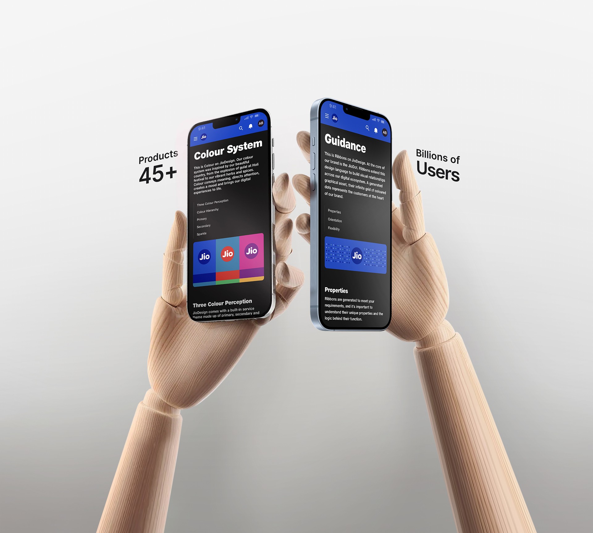
Colour use
Every product in the Jio ecosystem features light, dark, and bold color themes. Each theme consists of primary, secondary, and sparkle color groups in its palette. Each primary, secondary, and tertiary palette comprises 14 colors each (tints+shades+greys).
We have an in-house Jio Design System Figma plugin. It was designed and created for easy color application, maintaining consistency, and adhering to the core idea.
Regardless of the theme in which we create the Product Listing Card, we can easily re-theme the card for any other product within the ecosystem with a single click. Please watch the video below:
Colour significance in the Product Listing Card
Primary colors are exclusively used for CTAs.
Secondary colors are utilized for tags and other highlights.
Sparkle colors are employed for discount and offer-related highlights.
Please note that we use a mustard color from the core Jio color palette for ratings, which is independent of the color themes of ecosystem products.
We have created vertical specific prototypes of the PLP page using the PLC card component and tested them among the target audience.
Objectives of usability study
• Simplify the decision-making process for users.
• Evaluate how well users understand the information presented on the product listing cards.
• Check if users can interact with the cards in an intuitive manner.
• Measure the efficiency of users in finding relevant products.
• Confirm that the product listing cards are accessible to users with various abilities and disabilities.
• Identify user preferences regarding the display of information on the cards.
• Evaluate how well the product listing cards handle errors or unexpected user actions.
• Gather feedback on user satisfaction with the overall experience of using product listing cards.
• Use the findings from usability testing to make iterative improvements to the design and functionality of the product listing cards.
Few metrics
Example 1

Based on the findings, we have improved the visibility of the wishlist icon. We have also created a subtle micro-interaction along with heptic feedback for add to wishlist interaction.
We have created a couple options of the animation and tested them
Option 1
Option 2
We proceeded with the option 1. The idea was to provide users with the desired feedback so they are aware that the product has been added to their wishlist, reducing errors.
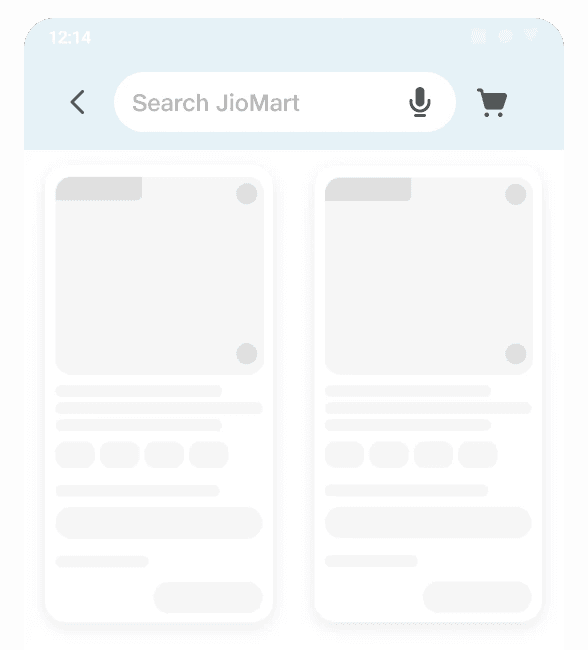
Example 2
Based on the findings, we have proceeded with Option 1. Additionally, we have included an extra text slot in case someone wants to write the rating in textual form.

Theme
We are using molecular-level Jio Design System (JDS) components like text field, buttons, badges, dropdown etc. to create the Master PLC Component. We have also created new molecular level components to use on PLC componenet.
As mentioned earlier the designers can apply the desired theme using our in-house Jio DS themer plugin for Figma. Please have a look:

Atomic design theory
We have included multiple slots within the molecular-level image component to cater to various types of usage. This feature will enable different verticals to accommodate diverse content based on user needs and business requirements.


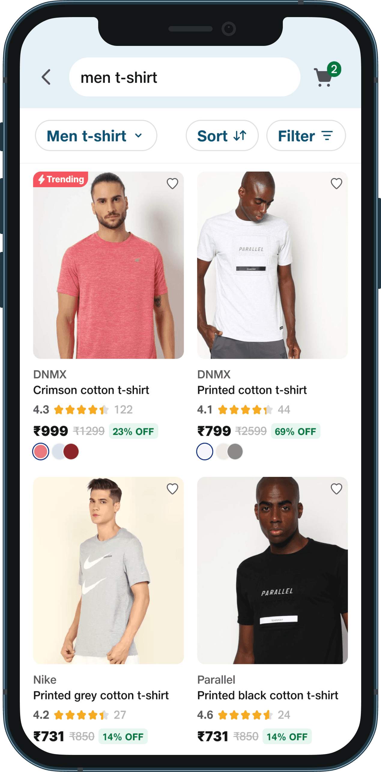
New Tira PLP (Makeup)
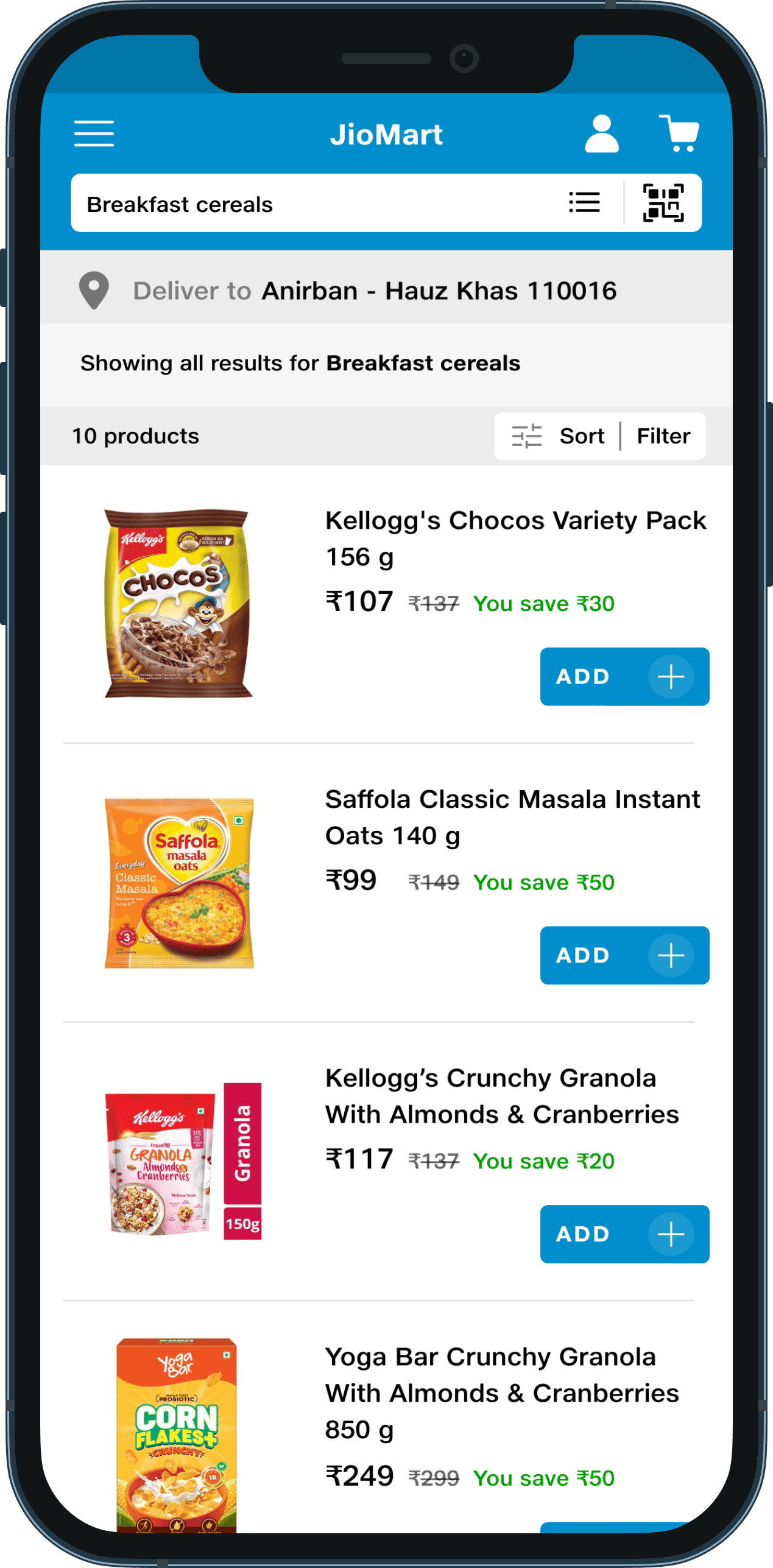
Old Netmeds PLP
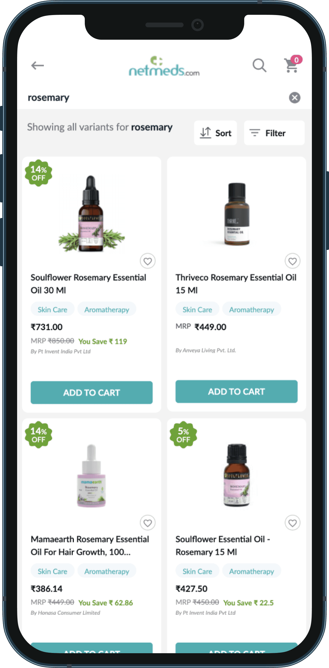
New PLP
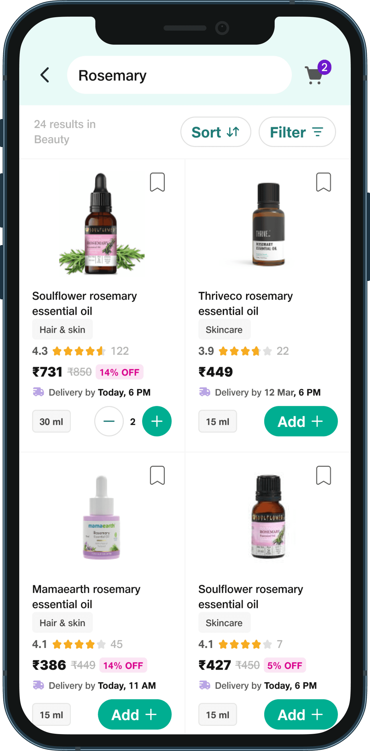
Old JioMart PLP
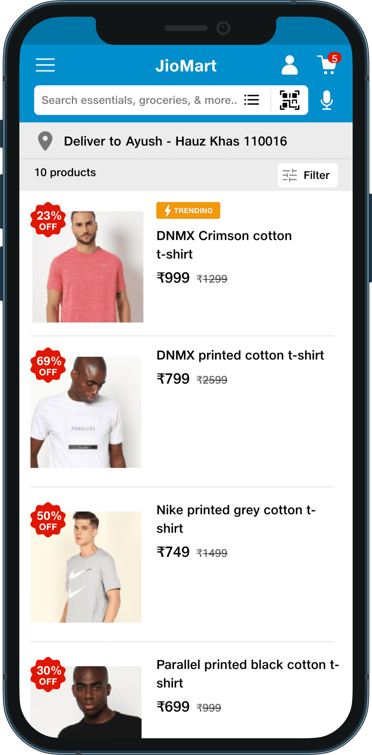
New PLP
Old JioMart PLP
New PLP (grid view)

New PLP (list view)

We adhere to a meticulous process of documentation for every UI component of the Jio Design System. This structured approach is integral to our design philosophy, ensuring that each element is comprehensively cataloged with detailed specifications, usage guidelines, and visual representations.
By meticulously documenting each component, we prioritize clarity, consistency, and seamless integration across all interfaces, empowering our teams to create exceptional user experiences.

We are currently implementing the PLC component in a few of our apps such as Jio.com, Reliance Digital, JioMart and Netmeds. We utilize Google Analytics to surface data about user behaviour in our iOS and Android apps, enabling us to make better decisions regarding our product and marketing optimization.
I will provide updates here once we have some solid results to share.
Please note that due to few constraints, I am unable to showcase the entire project. Let me know your thoughts!
We will continuously improve the product listing card component based on user inputs, business objectives and the latest design trends.